Complete Rebrand
M Jewelers Inc. approached us with the goal of reinventing their identity. The existing brand felt dated and no longer reflected their vision for the future. We created a full rebrand that modernized their presence, while keeping the integrity of their name. The result is a look that feels fresh, relevant, and aligned with their evolving audience.
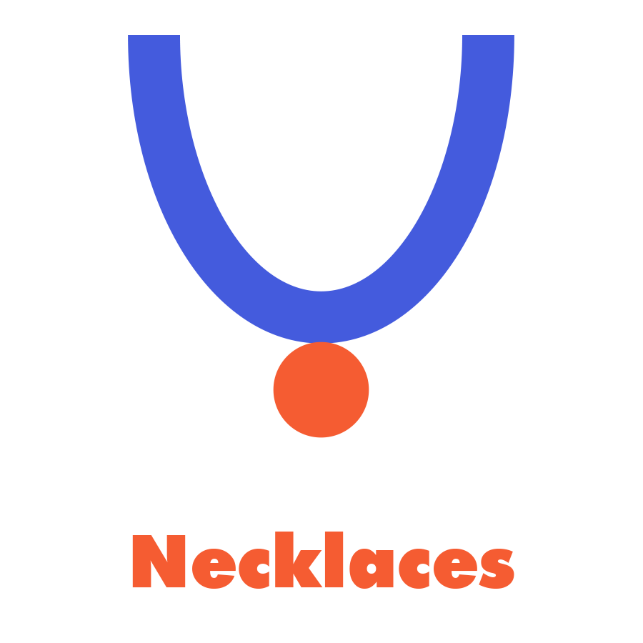
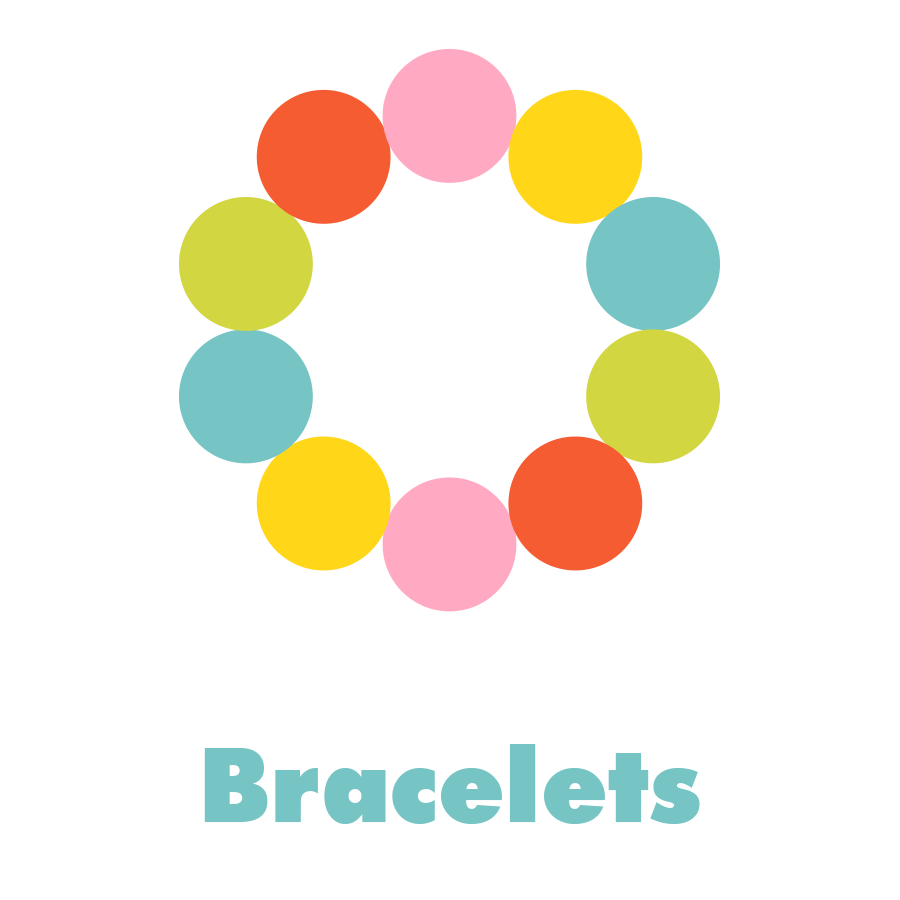
Colorful & Fun
The new brand leans into bold graphics and vibrant colors to bring energy and excitement to every touchpoint. By pairing simple typography with eye-catching styling, the design captures attention quickly and conveys a playful, approachable personality. This colorful direction makes the brand stand out in both digital and physical spaces.
Youthful & Energetic
At its core, the rebrand was about connecting with a younger, style-savvy audience. The combination of streamlined fonts, graphic shapes, and bright palettes creates a brand that feels dynamic and full of life. It communicates movement, confidence, and modern appeal—qualities that embody the next chapter of M Jewelers Inc.
The Website
I redesigned their website to better represent their three divisions: Breast Care, Compression, and Shop.The previous design leaned too feminine, which didn't align with their broader demographic, now inclusive of men, non-binary, transgender individuals, and more. The new website features an updated product catalog, improved navigation, and a fresh, modern aesthetic.
Jay Ann WebsiteThe Website
I redesigned their website to better represent their three divisions: Breast Care, Compression, and Shop.The previous design leaned too feminine, which didn't align with their broader demographic, now inclusive of men, non-binary, transgender individuals, and more. The new website features an updated product catalog, improved navigation, and a fresh, modern aesthetic.
Jay Ann WebsiteMore coming soon from this on-going project.